A Simple and Powerful Definition of Infographics
You’ve probably heard of infographics or seen one online many times. To people who enjoy them, infographics are a powerful definition of an effective marketing tool.
What is an Infographic?
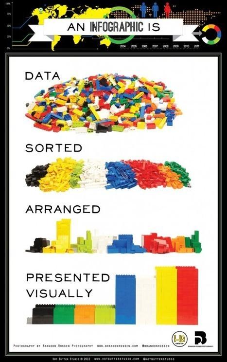
A powerful definition for an infographic is a type of marketing content that sorts, arranges, and visually presents data. The word itself is a clipped compound word formed from “information” and “graphics.” As a marketing tool, an infographic can be a simple and powerful way to share valuable content with your target audience.
To leverage what powerful infographics can deliver, you need to know how to sort, arrange, and visually prepare your data in a way that engages the audience to learn more about you as well as share that information with their circle of potential customers.
This guide explores the powerful definition of this marketing tool and offers best practices for infographics.
A Brief History of Infographics
In exploring the history of infographics, Smithsonian Magazine offers up a well-rounded perspective on the various forms we’ve seen over decades. Currently online we find digital versions of ways people represented data in the past. This may include printed maps to political, economic, and business graphs to weather charts.
In moving into the computer age, these infographics appeared in office-based software products like PowerPoint and Excel where graphs and charts could be generated. Now, there are web-based data visualization tools for interactive infographics, infographics with motion graphics, and augmented reality infographics.
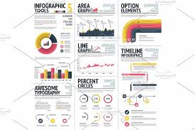
There are different types of infographics. For example, informational infographics tend to have more text than other types of infographics. A timeline infographic presents data in chronological order as a way to share information about specific events.
Other infographics focus on using charts and graphs to share the data in a visual way. “How to” and process infographics are used to illustrate a way of using a product or service. If you have a significant amount of quantitative data, you may want to create a numbers infographic. Some job candidates are even developing resume infographics to yield simple and powerful results as standout talent in the crowd.
Best Practices of Powerful Infographics
To gain traction with this marketing tool, here are some best practices to follow when creating your own infographics:
Tell a relevant story.
Focus on topical information where your thought leadership may benefit the current discussion. Use sites like BuzzSumo to show you what topics and content get the most views. This helps you shape the infographic around a viral topic in your business segment.
Leverage reliable data to back up that visual story.
The data should come from your own research. This may include a survey or other evidence you gathered from your target audience. Also, you can leverage data from other industry or analyst sources as well as existing industry or primary use cases. This data forms the “meat” of your infographic, providing your audience with qualitative and/or quantitative information to help them make decisions.
Connect to your overall marketing strategy, messaging, and value proposition.
Like all your marketing content, your infographics should reflect marketing strategy, overall messaging, and your brand’s main value proposition. Creating that consistency will reinforce what you offer to audiences. Before designing your infographics, keep these main ideas in mind to see how you can weave that into each infographic. The introduction and/or conclusion content is an ideal location to reinforce these ideas.
Use design elements that please the viewer.
Design the infographic for optimum readability. That means using a few contrasting colors and a legible font. Think about text color that doesn’t strain the eyes, such as using dark colors on light backgrounds. Keep the layout simple like a web page so you don’t overwhelm the reader. You can align the color palate with your brand color scheme if it makes sense. Also, rely on recognizable icons, such as a shopping cart versus bag.
Think and design in bite-size pieces.
Today’s audiences seem to have some of the shortest attention spans. To address that, keep your infographic succinct and visually divide up the text into small paragraphs or just simple sentences. This bite-size content makes your infographic more digestible and may even help viewers remember what they read.
Share, share, share.
If no one sees the infographic, it has no power, no matter how captivating or exceptional it is. Therefore, you have to get your infographic out there so that your audience can benefit from it as well as share it with others. For instance, consider posting it on SlideShare as well as your LinkedIn profiles and other social media channels. You may also want to generate an email campaign and share it with your database.
Plus, there are sites that may accept and publish your infographic, including visual.ly, Infographic Journal, and Infographic Directory. Develop a short blog post that features an embedded version of the infographic. Place this on your company or personal blog or for a guest blog post. Other ideas include submitting the infographic to media sites where you are a contributing author.
Lessons Learned
The powerful definition of infographics illustrates that simplicity of how the data is presented is paramount. More visuals and fewer words often help make infographics one of the most popular forms of content for both consumer and business audiences.


